
- Development
- Snippets
- center a table
- center an image
- ensures padding and borders are included in width/heights definitions
- global reset / clean slate
- center an image
- style first column of table
- style first cell in table header of tables
- target last row of table
- Custom properties (--*): CSS variables
- Bulletproof @font-face Syntax
- Considerations for styling the pre tag
- Create A Simple Responsive HTML Table Using Pure CSS
- Repeating lines / stripes
- Divs
- Learning resources
- change colour of selection highlights
- Responsive Tables
- Resources
13 Jul 2022
Development
10 Sep 2022
Took me a while to figure out, and tried a couple solutions (eg Whisk on macOS) before, but it seems it's easiest to develop/test straight in Chrome.
The CSS of the (live) HTML page can be found under Inspect > Sources > select the relevant .css file.
Changes are reflected in real-time, so no caching and/or publish time issues like with other approaches.
also, you can hide whole elements (eg for tests) with:
display: none;
Snippets
center a table
.center {
  margin-left: auto;
  margin-right: auto;
}
center an image
img {
  display: block;
  margin-left: auto;
  margin-right: auto;
  width: 50%;
}
ensures padding and borders are included in width/heights definitions
to be included in all CSS files
*,
::after,
::before {
    box-sizing: border-box;
}
global reset / clean slate
html, body, div, h1, h2, h3, h4, h5, h6, ul, ol, li, p, blockquote, pre, form, fieldset, table, th, td {
    margin: 0;
    padding: 0;
}
center an image
Needs all 3 properties:
.book {
    width: 60%;
    margin: auto;
    display: block;
}
style first column of table
eg to avoid whitespace wrapping
tbody > tr:first-child > td:first-child {
    white-space: nowrap;
}
style first cell in table header of tables
eg to remove formatting on table intersection with no content.
.rec_table thead th:first-child {
    background-color: white;
}
target last row of table
eg to have a border bottom at end of table
tr:last-child{ /*this will select last tr*/
      border: 2px solid black;
      background-color: yellow;
      }
Custom properties (--*): CSS variables
Property names that are prefixed with --, like --example-name, represent custom properties that contain a value that can be used in other declarations using the var() function.
Syntax
--somekeyword: left;
--somecolor: #0000ff;
--somecomplexvalue: 3px 6px rgb(20, 32, 54);
Bulletproof @font-face Syntax
https://www.paulirish.com/2009/bulletproof-font-face-implementation-syntax/
Considerations for styling the pre tag
https://css-tricks/considerations-styling-pre-tag/
Create A Simple Responsive HTML Table Using Pure CSS
with collapsed rows
https://www.exeideas.com/2020/10/simple-responsive-html-table.html
Repeating lines / stripes
.wip {
    background: repeating-linear-gradient(
                    135deg,
                    #fff000,
                    #fff000 10px,
                    #000 10px,
                    #000 20px
                );
}
Divs
How to divide a div in 2 halves:

#yellow {
        height: 100%;
        display: flex;
        flex-direction: column;
        background-color: rgb(214, 196, 0);
        order: 2;
        width: 100%;
    }

    #yellowL {
        position: relative;
        float: left;
        width: 50%;
        margin: auto;
        order: 1;
    }

    #yellowR {
        position: relative;
        float: right;
        width: 50%;
        margin: auto;
        order: 2;
    }
Learning resources
A Basic Walkthrough of the CSS Box Model
https://blog.hubspot.com/website/css-box-model
A Complete Guide to Flexbox
https://css-tricks/snippets/css/a-guide-to-flexbox/
Example - centering:
.parent {
  display: flex;
  height: 300px; /* Or whatever */
}

.child {
  width: 100px;  /* Or whatever */
  height: 100px; /* Or whatever */
  margin: auto;  /* Magic! */
}
11 Sep 2022
em vs rem

em compounds with each child, taking its parent element as reference.
rem is always relative to default font-size (set in CSS or browser default of 16px)
manage multiple fonts in same family
Choose your font on Google Fonts:

Select which weights you need and you can copy/paste the import code on the right:
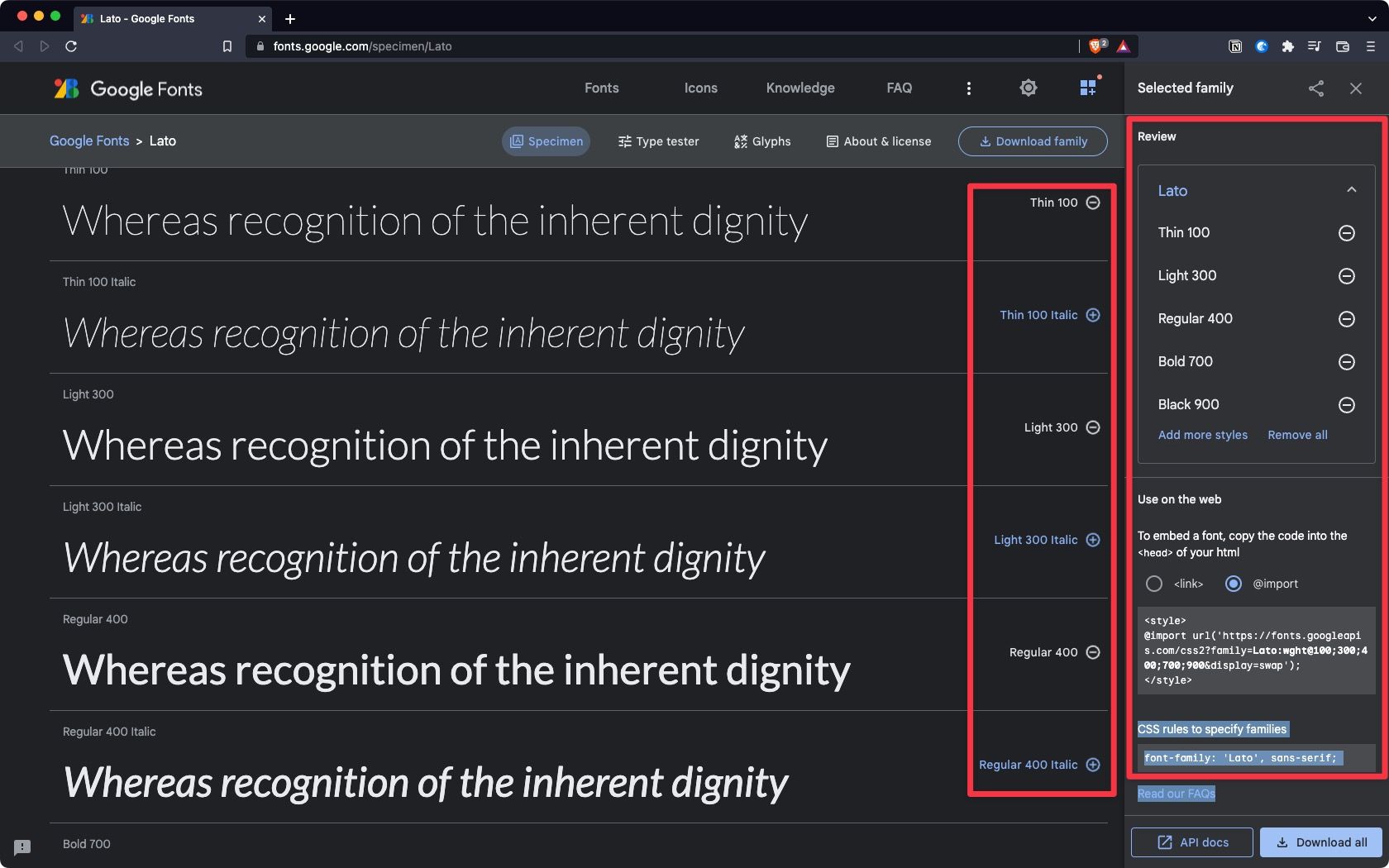
At the top of the CSS file, import family:
@import url('https://fonts.googleapis.com/css2?family=Lato:wght@100;300;400;700;900&display=swap');
and use them in CSS as:
font-weight: 900;
change colour of selection highlights
::selection {
  background: #da2222;
  text-shadow: none;
}
get CSS element that starts with
for element name
[id^=product]
^= indicates "starts with".
$= indicates "ends with".
more here:

for value within element
Q: how to target hyperlinks starting with /.., so only internal links get styled, not all?
20 Sep 2022 to be tested:
[id^=product]{property:value}
Responsive Tables
to collapse rows, add display: block; to th and td.
my preferred solution

resources


Resources

"The aim of web design is not to use all available screen space. It is legibility. Text is most legible with no more than 70 characters per line."
- Paul Graham
(note: 120 characters here!)